


get a consultation
We will advise you on the project, answer all your questions and offer the best solutions to the problem.
name
e-mail


let’s go
axon
( Website )
AXON is an AI platform that finds smart contract vulnerabilities


Axon is an AI platform that helps find vulnerabilities in smart contracts. The team approached us with a request: to update the site so that it would be understandable, convincing, and worthwhile for the weak and economically developed clients.
( About the Client )
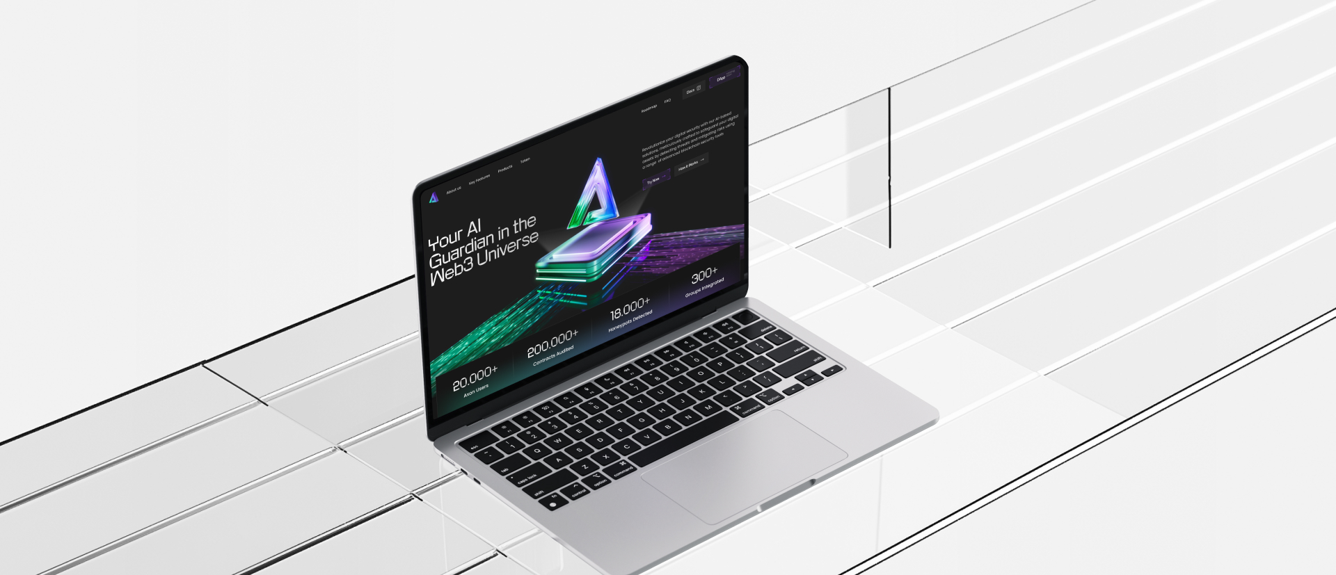
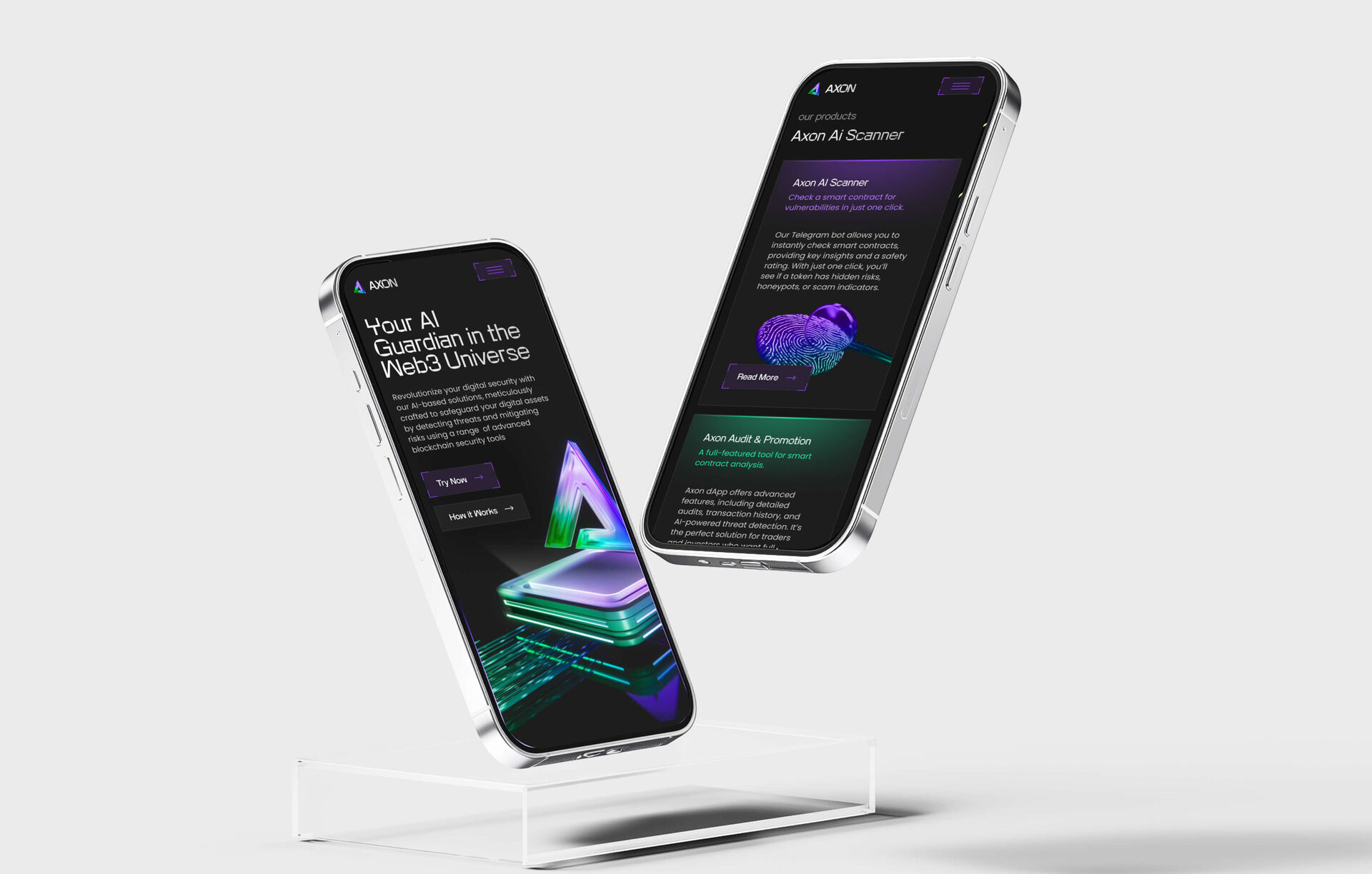
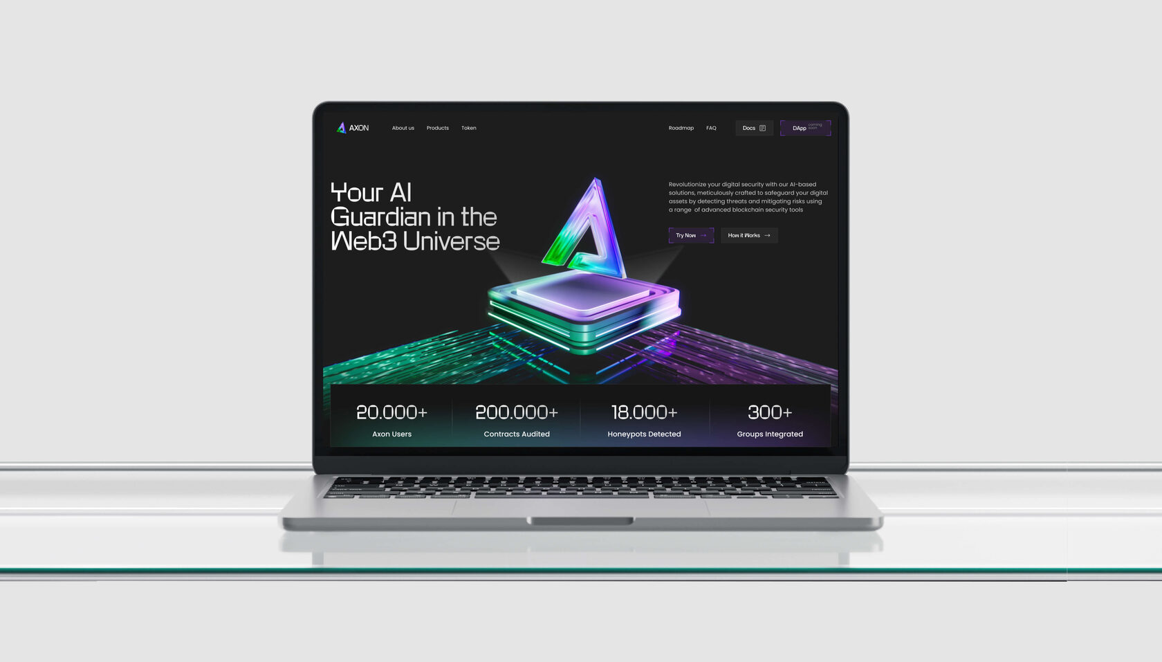
Main screen of the Axon page
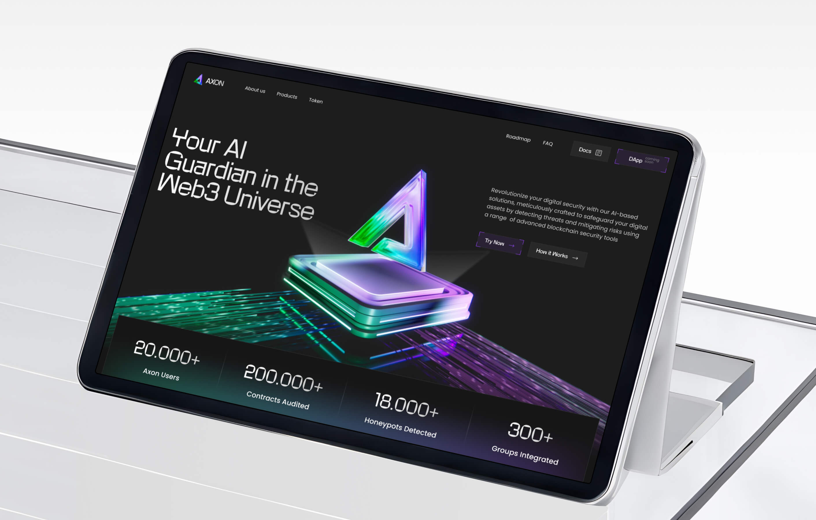
The client already had a website, but it didn’t solve the main task — it didn’t explain the value of the product and how it works. It was important: a complex AI product is simple, visual convergence, technology and security, the site should be convenient and logical for all levels of users
( Objective )
We started by immersing ourselves in the Axon project — a platform that helps identify vulnerabilities in smart contracts. Through a series of discovery calls with the team, we clarified their goals. We collected design references, analyzed competitors, and aligned on a key visual direction that would reflect Axon’s technological strength while remaining accessible to non-expert audiences.
01 - ( Research and Concept Development )
01 -
( Research & Concept )
( Research & Concept )
Moodboard with website and block references

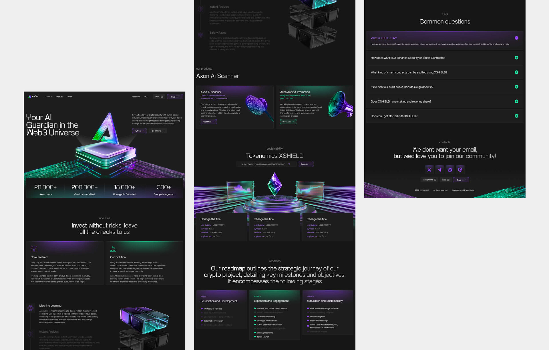
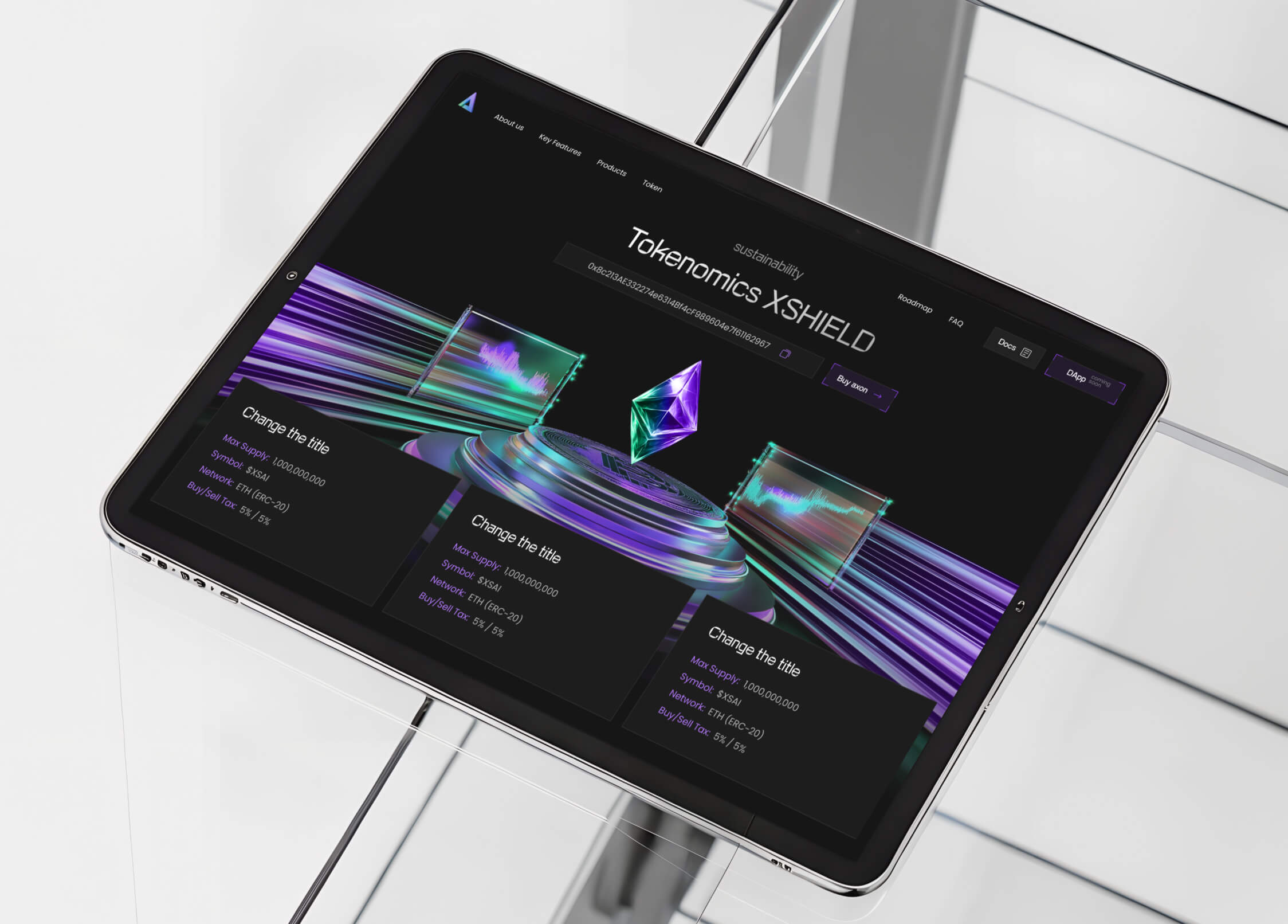
We added 3D elements and dynamic blocks to make the site look like a modern IT product. The main features are highlighted through dynamic visual elements, such as moving lines and platforms with logos, creating an interactive and engaging experience. These elements not only visually represent the functionality but also give the design a sense of smoothness, modernity, and technological sophistication.
02 - ( 3D Model Development )
02 -
( 3D Model )
( 3D Model )
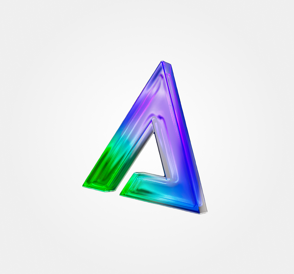
Animated 3D model
We developed a modern design with a focus on glass interfaces, thoughtful UX with simplified navigation; key design features: transparency, gradients, glossiness; put together a structure focusing on three main products; to make the site user-friendly and logical for all levels of users; hover prompts and minimalism in blocks — so as not to overwhelm
03 - ( Design in Figma )
Design main page
We carefully adapted the design for mobile devices, reworking the layout of blocks to ensure smooth and intuitive navigation on small screens. On screens as narrow as 375px, we simplified the interface and kept only the essential call-to-action elements — making the user journey more focused and efficient.
04 - ( Mobile and tablet Adaptation )
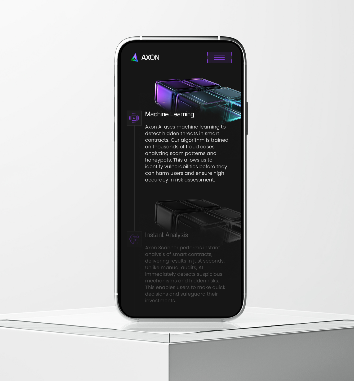
Mobile version of the product page
We added animation when hovering over the cards — a glass blur effect appears. This technique creates a sense of depth and volume, makes the interface "live" and tactile. This is not just a visual touch, but an element that influences the perception of the brand: it inspires trust, emphasizes technology and attention to detail.
05 - ( Development on Webflow )
05 -
( Webflow )
( Webflow )
Animation on the website
We updated the logo and visual identity to reflect the brand’s evolution and technological focus. The new style combines clarity, minimalism, and a sense of precision — aligning with the core values of the platform. We also prepared a full set of branded materials for presentations and social media.
06 - ( Additionally )
06 -
( more )
( more )
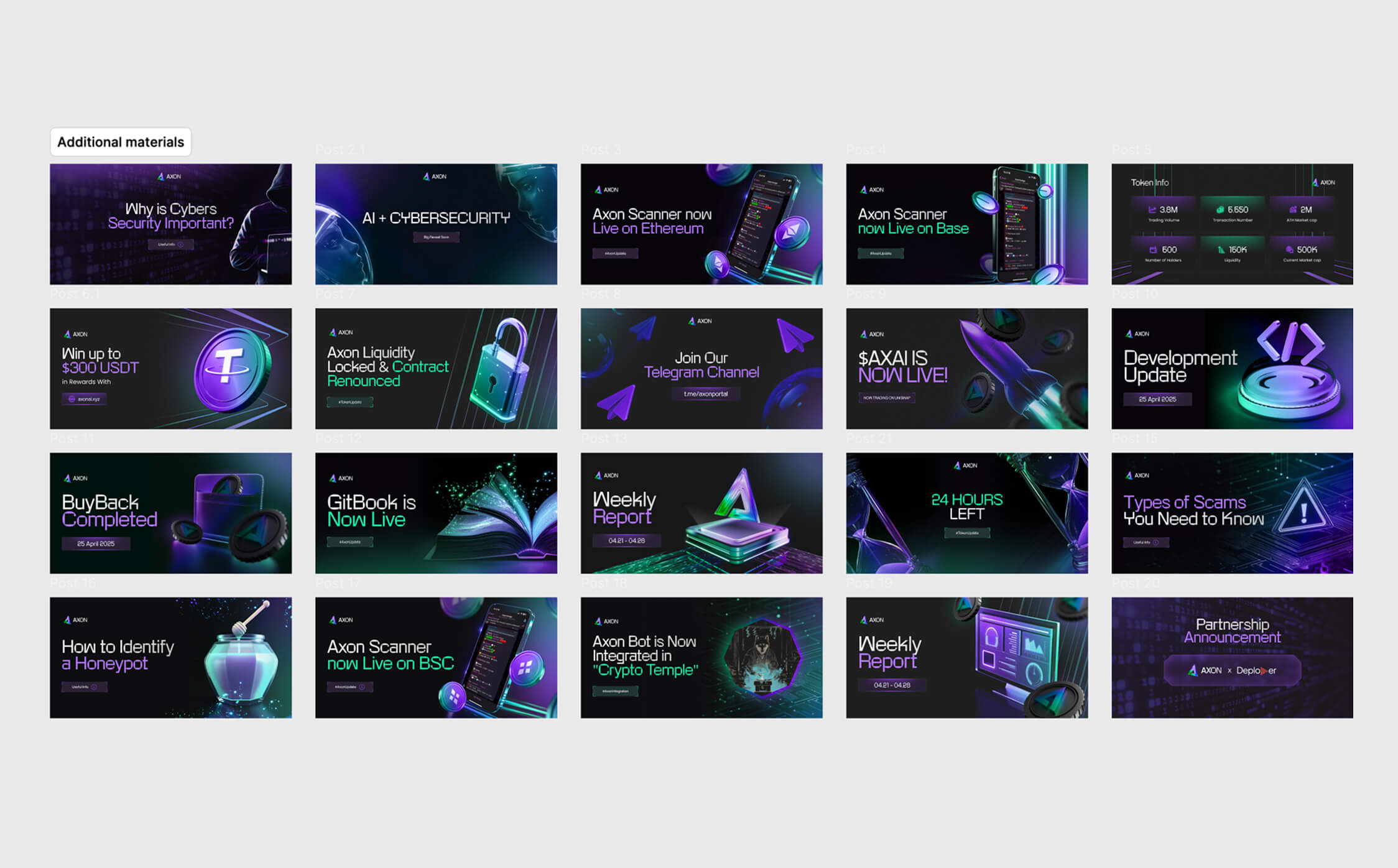
Additional materials: logo and materials for presentations and social media
We translated a complex AI product into an understandable digital language. The site has become selling, convincing and modern: it helps the company confidently present itself, explains the value of the technology, and works as a sales funnel tool — from the first visit to the investor’s decision.
( Project Team )

Elizaveta — Art Director

Evgenia — Creative Director

Irina — Designer

Alexandra — Developer

Dmitry — 3D Specialist
