


get a consultation
We will advise you on the project, answer all your questions and offer the best solutions to the problem.
name
e-mail


let’s go
BUY GOOD BUY
( Website )
E-Commerce Platform for Used iPhones
BUY GOOD BUY is an online service for selling and buying used iPhones. The project was created to test the niche, assess demand, and build trust in a young company. In conditions of high competition and general distrust towards the used device market, it was important not just to create a website, but to form a sense of reliability, transparency, and convenience.
( About the Client )
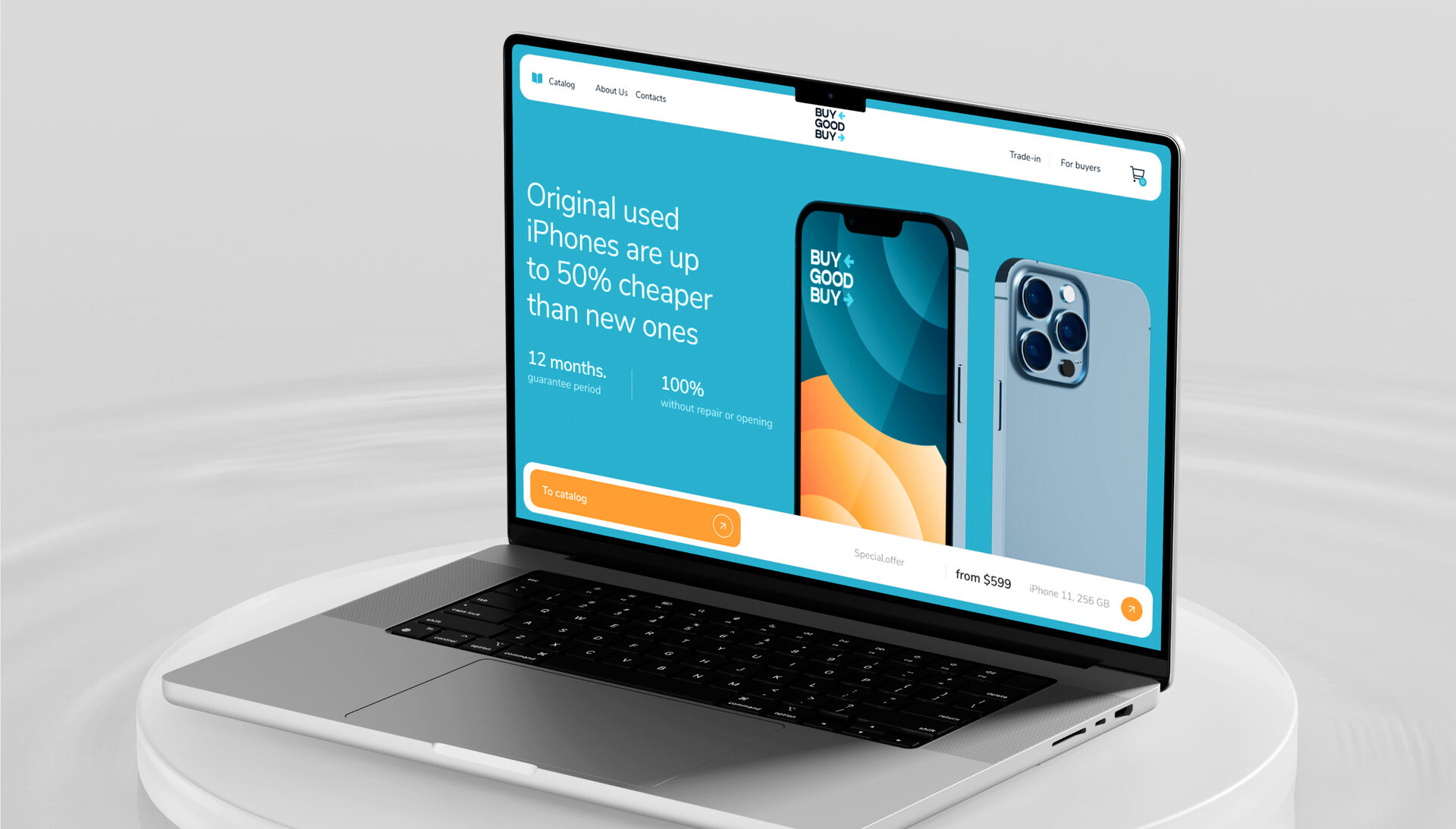
Main screen in mobile version

The main goal of the project was to create a modern and user-friendly e-commerce website that helps build trust in a young company and stand out from competitors. Considering the specifics of the used device market, it was important to design the user journey to eliminate potential customers’ doubts, demonstrate process transparency, and simplify the purchase. At the same time, the visual presentation needed to be bright and fresh without losing trustworthiness and structure.
( Objective )
We started by researching objections: fear of malfunction, doubts about quality, distrust of the brand. Each was addressed and resolved through structure and copy: device warranty, option to pay after inspection, clear purchase and return conditions, warm and open tone of communication.
01 - ( Analysis of user fears )
01 -
( Analysis of user fears )
( Analysis of user fears )
All fears have been reworked and formatted into understandable text.

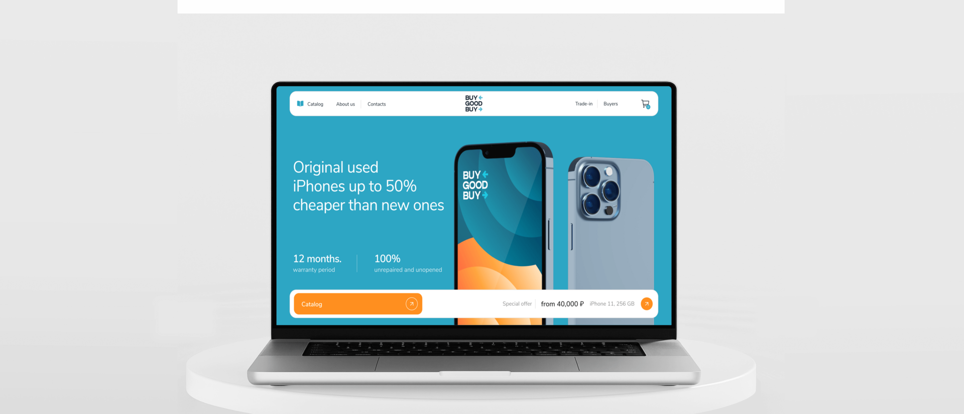
For the homepage, we chose a landing page format: from advantages to overcoming objections. All texts are written in a friendly and honest manner to emphasize transparency and evoke sympathy.
02 - ( Positioning
and copywriting )
and copywriting )
02 -
( texts )
( texts )
Home page first screen

The style foundation consisted of bright accent colors and unique gradient circles on device screens — an idea not seen among competitors. This way, we combined emotional visuals with functional presentation to make the site modern, warm, and memorable.
03 - ( Design and visual identity )
Home page design

Design of the block with reviews

Mobile version of the main page

Catalog page design

Well-developed catalog and filtering logic

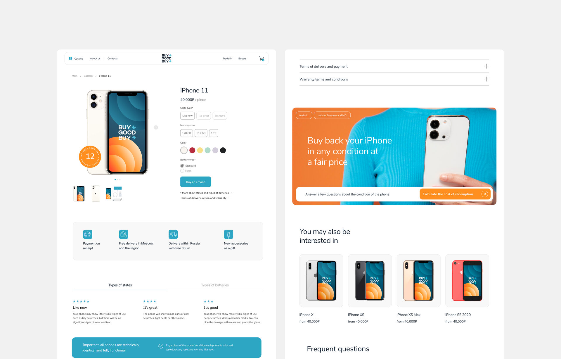
Most e-commerce projects in this niche are overloaded. Our task was to make the product card light yet complete. We focused on logical hierarchy, key features on the first screens, hidden blocks for additional information. This improved perception while maintaining all necessary depth.
05 - ( Internal Pages )
05 -
( Internal Pages )
( Internal Pages )
Block “Services”

Product card page
We created a strong and convincing design that solves several tasks at once: helps build trust, addresses objections, forms visual recognition, and turns BUY GOOD BUY into a full-fledged brand. The site became an excellent foundation for testing demand and further scaling.
( Project Team )

Elizaveta — Art Director

Evgenia — Creative Director
